
Table of Contents
Introduction to Bootstrap
In the ever-evolving landscape of web development, BS has emerged as a powerhouse, simplifying the process of building responsive and visually appealing websites. Let’s dive into the fundamentals of Bootstrap, explore its origins, and understand why it has become a staple for web developers worldwide.
A Brief History and Background
BS, initially developed by Twitter, was released as an open-source front-end framework in 2011. The primary objective was to provide developers with a set of tools to streamline the creation of consistent, responsive designs. Over the years, BS has evolved, garnering immense community support and contributing to the standardization of web development practices.
Importance of Using a Responsive Framework
In the current digital era, where users access websites on various devices, responsiveness is non-negotiable. BS addresses this crucial need by offering a responsive grid system. This grid allows developers to create layouts that adapt seamlessly to different screen sizes, ensuring a consistent user experience across desktops, tablets, and smartphones.
Overview of Bootstrap’s Key Features
Bootstrap’s popularity stems from its rich feature set. It provides a plethora of pre-designed components like buttons, forms, navigation bars, and more, saving developers valuable time and effort. The framework also includes an extensive set of CSS and JavaScript files, ensuring a robust foundation for building modern, feature-rich websites.
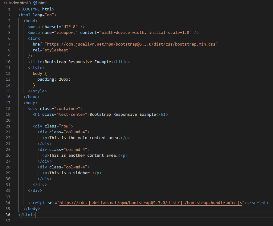
In this example you can see that:
- The Bootstrap CSS and JS files are linked from a CDN for easy access.
- The layout is divided into a three-column grid using Bootstrap’s grid system.
- The
<meta>tag with theviewportattribute ensures proper rendering and responsiveness on various devices.
Getting Started with Bootstrap
Now that we understand the significance of BS, let’s delve into getting started with this powerful framework. The first step involves installing BS into your project. This can be achieved by including the BS CSS and JavaScript files in your HTML document. The official BS documentation provides detailed instructions, making the installation process straightforward.
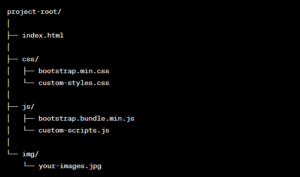
Here’s a brief explanation of each folder and file:
- index.html: This is your main HTML file where you write the structure of your web page.
- css/: This folder contains the CSS files, including the minified version of the Bootstrap CSS file (
bootstrap.min.css). You may also have a custom CSS file (custom-styles.css) where you can add your project-specific styles. - js/: This folder contains the JavaScript files, including the BS JavaScript bundle (
bootstrap.bundle.min.js). You can also have your custom JavaScript file (custom-scripts.js) for additional scripts. - img/: This folder is for storing images used in your project. You may have various image files here, such as logos or other graphics.
This structure provides a clean separation of files, making it easy to manage your project’s assets and keeping the BS files in dedicated folders. Remember that this is a basic structure, and depending on the complexity of your project, you may have additional folders for different assets or sections of your website.
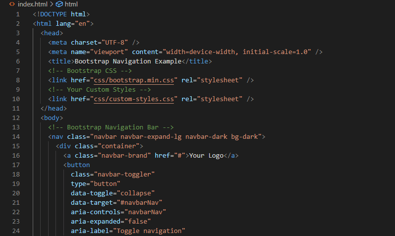
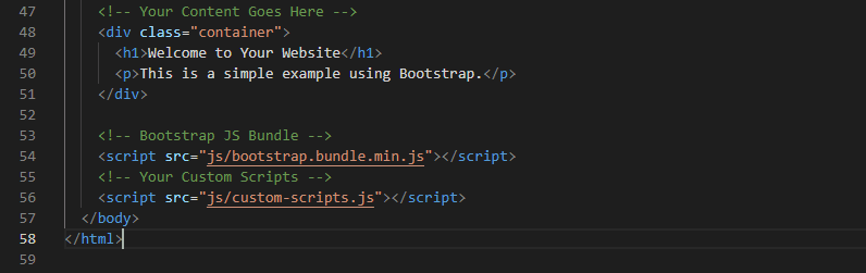
Basic Template Structure
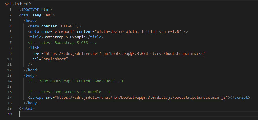
BS simplifies the creation of HTML templates with its predefined structure. A basic template includes the necessary HTML5 doctype declaration, meta tags for viewport configuration, and links to the Bootstrap CSS and JavaScript files. This structure serves as a solid starting point for building responsive web pages.
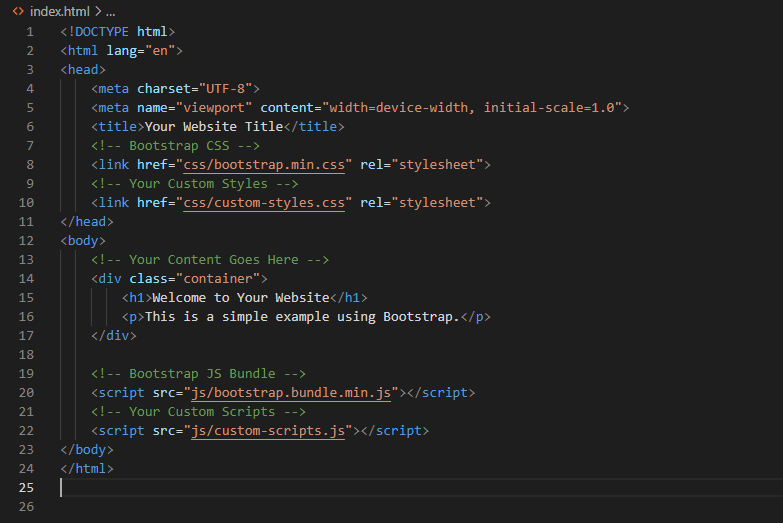
In this snippet:
- The
<!DOCTYPE html>declaration specifies the document type and version of HTML. - The
<meta>tags set the character set and define the viewport for responsive design. - The
<title>tag sets the title of your web page. - Bootstrap’s CSS is linked using the
<link>tag within the<head>section. - Your custom styles can be added in a separate CSS file (in this case,
custom-styles.css). - The main content goes within the
<body>section, and a simple container div is used for layout. - Bootstrap’s JavaScript bundle and your custom scripts are linked at the end of the
<body>section.
Explanation of Bootstrap’s Grid System
One of Bootstrap’s standout features is its grid system, a powerful layout utility that enables the creation of flexible and responsive designs. The grid consists of a 12-column layout that can be easily customized to accommodate various screen sizes. This flexibility empowers developers to create visually appealing and functional layouts without the need for extensive custom CSS.


In this example:
- The grid system is used within the
containerclass. - The columns are defined using the
col-md-4class, indicating that each column should take 4 out of 12 available columns on medium and larger screens. - Another row with
col-sm-6classes is added, indicating that each column should take 6 out of 12 available columns on small and larger screens. - A final row with a single
col-12class is used for a full-width column on extra-small screens.
In this introduction, we’ve scratched the surface of Bootstrap’s capabilities. Stay tuned as we explore deeper into BS components, advanced features, and best practices for maximizing the potential of this versatile framework. BS is not just a tool; it’s a game-changer in the world of web development.
Getting Started with Bootstrap
If you’re ready to elevate your web development game, BS is your go-to toolkit for crafting responsive and visually appealing websites effortlessly. In this section, we’ll guide you through the initial steps of getting started with BS, from installation to understanding the fundamental structure.
Installation Guide
Before diving into the wonders of BS, you need to integrate it into your project. Luckily, the process is straightforward. Begin by including the Bootstrap CSS and JavaScript files in your HTML document. You have two main options: downloading the files and hosting them locally or linking directly to the Bootstrap CDN (Content Delivery Network) for faster loading times.
Basic Template Structure
Now that BS is part of your project, let’s explore the basic template structure that sets the foundation for your web pages. BS provides a clean and efficient structure, ensuring a consistent layout across various devices.

By adopting this structure, you’ve laid the groundwork for a responsive and visually harmonious website. As you progress in your BS journey, you’ll discover its vast array of components and customization options. Stay tuned for our exploration of BS components in the upcoming sections.
Bootstrap Components
Now that you’ve set the groundwork with BS, it’s time to explore the heart of this framework: its rich collection of pre-designed components. BS components are the building blocks that empower you to create sleek and functional user interfaces without delving into the complexities of extensive custom coding.
Overview of Essential Bootstrap Components
BS simplifies the development process by providing a variety of components that cover everything from navigation bars and buttons to forms and alerts. Let’s take a closer look at some key components:
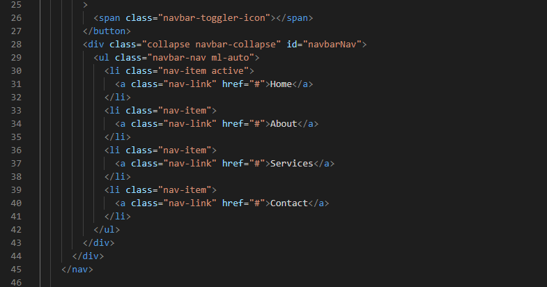
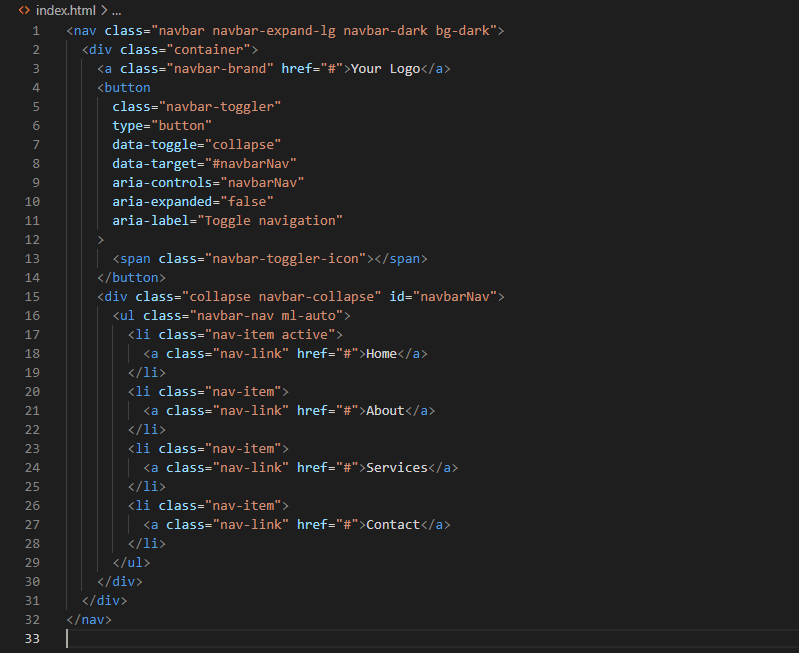
Navigation Bars
Bootstrap’s navigation components, including the responsive navbar, simplify the creation of intuitive navigation menus. The navigation bar adjusts seamlessly to different screen sizes, providing a smooth user experience on both desktop and mobile devices.
Buttons
BS offers a versatile set of button styles. These can be easily customized and adapted to suit your design preferences. The classes include btn-primary, btn-secondary, and more, allowing you to maintain a consistent and visually appealing button hierarchy.

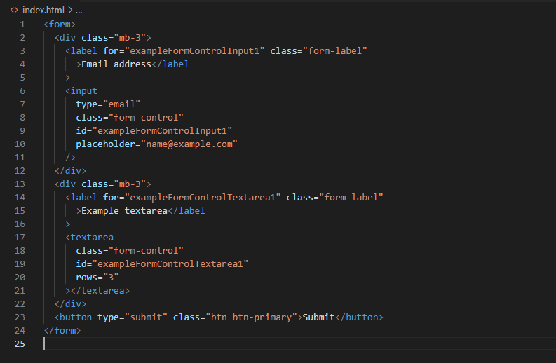
Forms
Building user-friendly forms is a breeze with BS. The framework provides styling for form elements like input fields, checkboxes, and radio buttons, ensuring a cohesive look across your entire application.
Alerts
Keep your users informed with BS alerts. Whether it’s a success message, a warning, or an error notification, Bootstrap provides predefined alert styles that enhance the overall user experience.

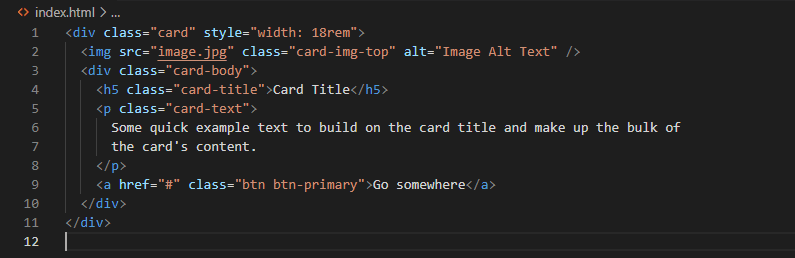
Cards
Cards are versatile components that allow you to present content in an organized and visually appealing manner. With BS cards, you can easily create layouts for articles, user profiles, or any other content grouping.
How to Use and Customize Bootstrap Components
Using BS components is a matter of applying the relevant CSS classes to your HTML elements. For example, to create a primary button, simply add the btn btn-primary classes. This simplicity not only accelerates development but also ensures a consistent design language throughout your project.
Customization is another strong suit of BS. By leveraging utility classes and variables, you can tailor the appearance of components to match your project’s unique aesthetic. The official BS documentation provides extensive guidance on customization options.
Advanced Bootstrap Features
As you delve deeper into BS, you’ll discover a treasure trove of advanced features that elevate your web development experience. From responsive design principles to extensive customization options, BS provides tools that empower you to create sophisticated and visually stunning websites.
Responsive Design Principles
Bootstrap’s core strength lies in its responsiveness. The framework employs a fluid grid system, ensuring your website seamlessly adapts to various screen sizes. Whether your users are browsing on a desktop, tablet, or smartphone, Bootstrap’s responsive design principles guarantee a consistent and user-friendly experience.
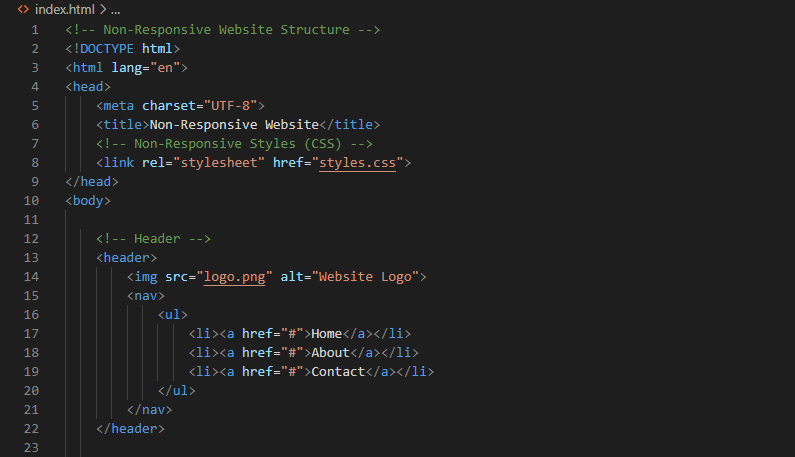
Non-Responsive Website

Bootstrap-Powered Responsive Website
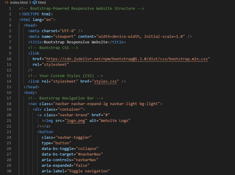
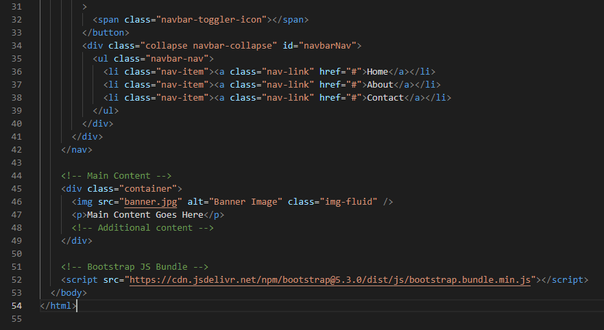
In the BS-powered responsive website, Bootstrap’s grid system is utilized, and the navigation bar is responsive. The img-fluid class ensures that images resize proportionally. This example assumes you are using Bootstrap 5.3.0, and you can customize it further based on your specific requirements.
Customization Options
One of Bootstrap’s standout features is its flexibility. The framework allows extensive customization to align with your project’s unique branding and style requirements. By leveraging utility classes and predefined variables, you can effortlessly modify colors, typography, and other design elements.
Customized Buttons
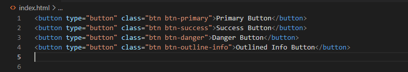
In this example, Bootstrap’s button classes are used to customize the appearance of buttons. You can apply different classes to achieve various styles, including primary, success, danger, and outlined buttons.
Customized Typography

BS provides classes to customize typography. In this example, classes like h1, lead, text-muted, and text-uppercase are used to apply specific styles to paragraphs.
Customized Color Schemes

Bootstrap’s color classes can be applied to elements like alerts. In this example, alerts are customized using alert-primary, alert-success, and alert-danger classes, representing different color schemes.
Customized Background and Text Color
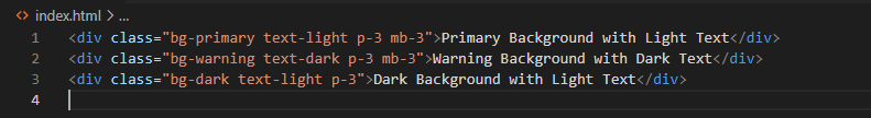
BS provides background and text color classes. In this example, the bg-primary, bg-warning, and bg-dark classes are used to set different background colors, and the text-light and text-dark classes determine the text color.
Integration with JavaScript
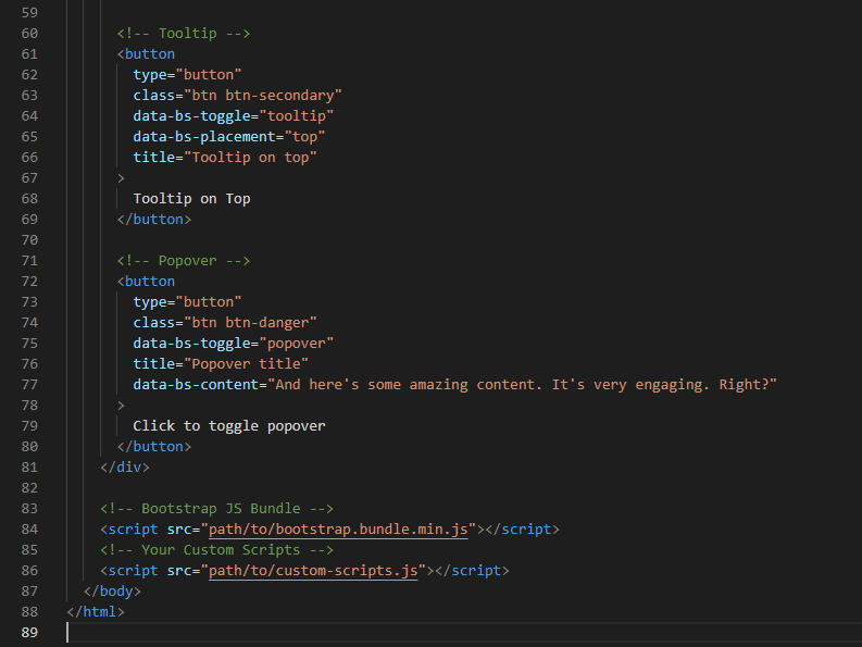
BS seamlessly integrates with JavaScript, adding an extra layer of interactivity and functionality to your websites. From modal dialogs and carousels to tooltips and popovers, Bootstrap’s JavaScript components enhance user engagement without the need for complex scripting.
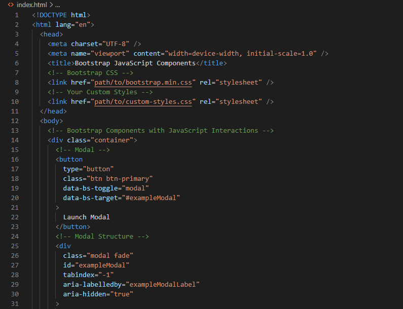
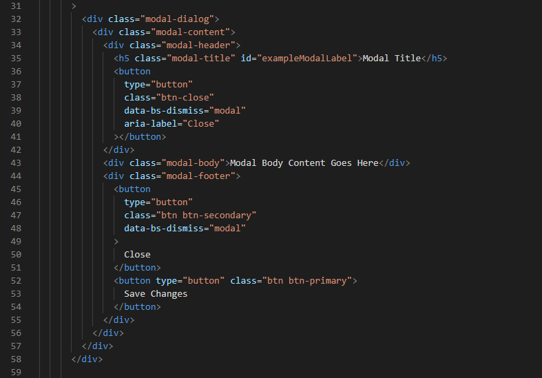
In this structure:
- Modal: A button triggers the display of a modal dialog with a title, body content, and buttons for interaction.
- Tooltip: A button with a tooltip that appears when hovered over.
- Popover: A button that toggles a popover with a title and content when clicked.
The BS JavaScript components are initialized and controlled through data attributes (data-bs-*) and JavaScript functions provided by Bootstrap’s JavaScript bundle (bootstrap.bundle.min.js). Ensure that you include the necessary BS JavaScript files and initialize the components correctly for them to function properly.


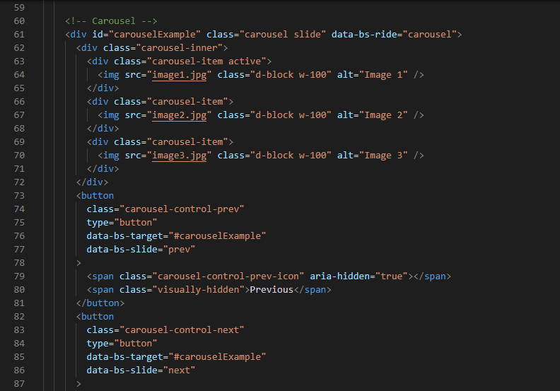
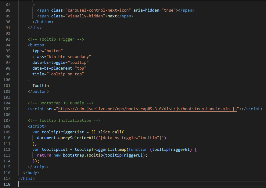
This example includes:
- Modal Dialog: A button triggers the display of a Bootstrap modal with a title, content, and buttons.
- Carousel: An image carousel with navigation controls.
- Tooltip: A button with a tooltip that appears on hover.
You must ensure that you have the appropriate BS JavaScript files included, and this structure will allow you to easily integrate and customize these components according to your needs.
Optimizing Performance
Performance is a critical aspect of any web development project. Bootstrap’s modular structure allows you to include only the components you need, reducing unnecessary bloat and enhancing overall page load times. Additionally, BS provides options for minimizing and optimizing CSS and JavaScript files for improved performance.
SEO-Friendly Practices
BS follows best practices for search engine optimization (SEO), ensuring that your website is easily discoverable by search engines. The clean HTML structure and adherence to semantic markup contribute to better indexing, positively impacting your site’s visibility in search results.
Common Mistakes to Avoid
As you navigate the advanced features of Bootstrap, it’s crucial to be aware of common pitfalls. Avoiding these mistakes, such as unnecessary overrides or neglecting accessibility considerations, ensures a smooth development process and optimal performance.
Incorporating these advanced BS features not only enhances the visual appeal of your website but also streamlines development and promotes a positive user experience. As you continue your BS journey, explore the documentation to uncover additional features and stay updated on best practices for maximizing the potential of this powerful framework.
Best Practices and Tips
As you embark on your BS journey, adopting best practices is crucial for efficient and maintainable web development. Here are key tips to enhance your Bootstrap projects:
Embrace Responsive Design
Bootstrap’s core strength lies in its responsiveness. Always prioritize creating designs that adapt seamlessly to various screen sizes. Utilize the grid system to structure layouts and ensure a consistent user experience across devices.
in the post above there are example of images with a non-responsive website versus a BS-powered responsive website.
Leverage the Grid System Effectively
Mastering Bootstrap’s grid system is fundamental. Understand the use of containers, rows, and columns to create flexible and responsive layouts. Avoid unnecessary nesting, keeping your structure clean and maintainable.
Customize Carefully
While BS offers extensive customization options, be judicious in your choices. Customize only what is necessary to maintain a cohesive design language. Over-customization may lead to increased file sizes and potential conflicts.
Optimize Asset Loading
To enhance performance, only include the BS components and JavaScript features your project requires. Optimize CSS and JavaScript files by minimizing and bundling them. This reduces page load times and ensures a smoother user experience.
Stay Updated
BS is a dynamic framework with continuous updates and improvements. Regularly check for the latest releases and update your projects accordingly. Staying current ensures access to new features, bug fixes, and security patches.
Latest Version – Bootstrap 5
Outdated Version – Bootstrap 3
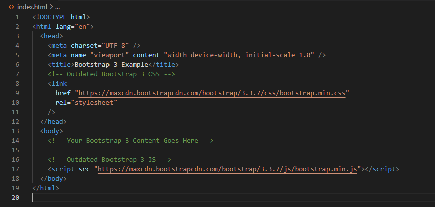
Key Points of Comparison
CSS Link
- Bootstrap 5 uses
https://cdn.jsdelivr.net/npm/bootstrap@5.3.0/dist/css/bootstrap.min.css. - Bootstrap 3 uses
https://maxcdn.bootstrapcdn.com/bootstrap/3.3.7/css/bootstrap.min.css.
JS Script
- Bootstrap 5 uses
https://cdn.jsdelivr.net/npm/bootstrap@5.3.0/dist/js/bootstrap.bundle.min.js. - Bootstrap 3 uses
https://maxcdn.bootstrapcdn.com/bootstrap/3.3.7/js/bootstrap.min.js.
Accessibility Matters
Follow accessibility best practices when designing your BS-powered websites. Ensure proper usage of semantic HTML elements, provide meaningful alternative text for images, and test your site with accessibility tools.
Use Utility Classes Wisely
Bootstrap’s utility classes offer quick styling solutions. However, use them judiciously to avoid cluttering your HTML. Reserve utility classes for specific situations where a quick adjustment is needed.
Keep Code Modular
Organize your code into modular components, separating concerns for improved maintainability. This approach facilitates collaboration, debugging, and the ease of making updates to specific sections without affecting the entire project.
Test Across Browsers
BS is designed to be compatible with various browsers, but thorough testing is essential. Verify that your website functions correctly across popular browsers, including Chrome, Firefox, Safari, and Edge.
Documentation is Your Friend
Refer to the official BS documentation regularly. It serves as a comprehensive guide, offering insights into components, customization options, and best practices. Familiarity with the documentation enhances your development efficiency.
By adhering to these best practices and tips, you’ll streamline your BS development process and create web experiences that are not only visually appealing but also performant and user-friendly.
Conclusion: Mastering Bootstrap for Modern Web Development
In the ever-evolving landscape of web development, BS stands tall as a versatile and powerful framework, simplifying the creation of responsive and visually appealing websites. In this comprehensive guide, we explored the fundamental categories every web developer should grasp to harness Bootstrap effectively.
Starting with an insightful introduction, we delved into the core components of BS – its grid system, navigation bar, forms, and the myriad of UI elements it offers. The hands-on exploration of Bootstrap’s structure on different devices and the installation process equipped you with practical insights for seamless integration.
“Getting Started with BS” laid the groundwork, emphasizing the importance of a solid foundation and the essential steps to initiate your Bootstrap journey. You discovered the significance of a well-organized folder structure, and we provided a snippet of the basic HTML template structure with BS included.
Moving into the heart of BS, we explored its components, focusing on the responsive nature of navigation bars and the application of BS classes on various elements. Practical examples and demonstrations illustrated the framework’s capabilities, setting the stage for advanced features.
The journey continued with a detailed exploration of advanced BS features, showcasing the framework’s prowess in creating responsive, accessible, and visually striking websites. We highlighted the significance of responsive design, customization, and the responsible use of Bootstrap’s utility classes.
In the penultimate section, we compared a non-responsive website with a BS-powered responsive website on different devices, driving home the impact of Bootstrap’s responsive design on user experience.
Finally, we discussed best practices and tips for BS development, emphasizing the importance of responsiveness, effective use of the grid system, and judicious customization to achieve a fine balance between Bootstrap’s default styles and tailored modifications.
As you embark on your BS journey, remember that the web development landscape is dynamic. Stay updated with the latest BS releases, adopt best practices, and embrace the framework’s flexibility to create web experiences that not only meet but exceed user expectations.
BS empowers developers to build modern, responsive, and visually compelling websites with efficiency and ease. Whether you are a seasoned developer or just starting, the insights shared in this guide are your compass in navigating the vast possibilities of BS.
Now, armed with knowledge and practical examples, go forth and craft exceptional web experiences using BS. May your websites be responsive, your designs be captivating, and your development journey be filled with creativity and success. Happy coding!