Unlocking Excellence in Web Design: Best Practices
In the realm of web design, where style meets functionality, Cascading Style Sheets plays a pivotal role in shaping the visual identity and user experience of a website. To navigate the intricate world of CSS effectively, developers must embrace best practices that not only enhance code quality but also contribute to improved performance and maintainability. In this blog post, we embark on a journey through the latest features, essential techniques for responsive design, and the meticulous art of optimizing styles for peak performance. Join us as we explore the best practices in it, empowering you to unlock excellence in your web design endeavors.
Table of Contents
Introduction to CSS
Brief Overview of CSS and its Importance in Web Development
Short for Cascading Style Sheets, is the cornerstone of web design, serving as the language that defines the visual presentation of a website. In this section, we’ll provide a concise overview and emphasize its crucial role in the realm of web development.
What is CSS?
CSS is a style sheet language used to describe the look and formatting of a document written in HTML. Its primary purpose is to separate the structure and content of a webpage from its visual presentation. By doing so, CSS allows developers to control the layout, colors, fonts, and other stylistic aspects, ensuring a seamless and visually pleasing user experience.
The CSS Syntax
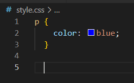
It is employs a straightforward syntax. Rules are created by pairing selectors with declarations. Selectors target specific HTML elements, and declarations specify the styling properties for those elements. For example, to change the color of all paragraph text to blue, you would write a rule with the selector “p” and the declaration “color: blue.”
Importance in Web Development
CSS is integral to web development for several reasons:
- Consistency Across Devices: It enables developers to create a consistent look and feel across various devices and screen sizes. This is vital for delivering a seamless user experience, regardless of whether a visitor is using a desktop, tablet, or smartphone.
- Enhanced Aesthetics: Through it, designers can bring creativity to the forefront. It allows for the customization of fonts, colors, and layouts, giving websites a unique and visually appealing identity.
- Responsive Design: With the growing prevalence of mobile devices, responsive design has become imperative. It plays a pivotal role in making websites adapt to different screen sizes, ensuring content remains accessible and well-presented.


Historical Context and Evolution of CSS
Transform your designs into professional, eye-catching visuals with Renderforest. Sign up today and start your journey to creating <strong>beautiful mockups</strong> effortlessly.
To truly appreciate the power of Cascading Style Sheets , it’s essential to explore its historical roots and trace the remarkable evolution that has shaped it into the indispensable tool it is today.
The Birth of CSS
It is emerged in the mid-1990s as a response to the increasing complexity of web design. During this period, HTML (Hypertext Markup Language) was the primary language for creating web pages, but it lacked the sophistication needed to control the visual presentation.
In 1996, the World Wide Web Consortium (W3C) introduced CSS as a separate styling language. Its purpose was to enable developers to apply styles to HTML documents without altering the underlying structure. This separation marked a pivotal moment in the history of web development.
CSS1: The First Standard
The initial version, CSS1, was published in 1996. It provided a set of basic styling properties, including font styles, colors, and text alignments. Although limited by today’s standards, CSS1 laid the groundwork for the separation of content and presentation, setting the stage for more robust future developments.
CSS2: Expanding Capabilities
CSS2 followed in 1998, introducing new features such as positioning and z-index, which allowed for more sophisticated page layouts. This version addressed some of the limitations of CSS1 and contributed to the growing acceptance of CSS as an essential part of web design.
CSS3: A Leap Forward
The evolution of CSS took a significant leap with the introduction of CSS3. Unlike its predecessors, CSS3 was modularized, allowing for the gradual introduction of new features without waiting for a comprehensive update. This modularity fostered quicker adoption and implementation of cutting-edge styling capabilities.
Importance of CSS Evolution
The continuous evolution is driven by the dynamic nature of the internet and the ever-changing landscape of digital devices. It has adapted to accommodate responsive design, mobile devices, and the increasing demand for visually rich and interactive web experiences.
CSS Frameworks
In the fast-paced world of web development, the frameworks have emerged as indispensable tools, streamlining the styling process and empowering developers to create responsive and visually appealing websites with greater efficiency.
What Are CSS Frameworks?
Frameworks are pre-prepared libraries that include standardized, reusable code for common styling tasks. They provide a foundation for structuring and styling web pages, saving developers time and effort by offering a set of predefined classes and components.
Popular CSS Frameworks
- Bootstrap:
- Bootstrap is one of the most widely used CSS frameworks. Developed by Twitter, it offers a responsive grid system, a vast array of pre-designed components, and a variety of utility classes. Bootstrap is known for its ease of use and quick integration.
- Foundation:
- Foundation is another robust CSS framework, providing a responsive grid, UI components, and JavaScript plugins. It’s highly customizable, allowing developers to tailor the framework to suit the specific needs of their projects.
- Tailwind CSS:
- Tailwind CSS takes a different approach by offering low-level utility classes that you can combine to build custom designs. It’s highly configurable and gives developers fine-grained control over the styling process.
Advantages of Using CSS Frameworks
- Rapid Development:
- Frameworks accelerate development by providing a solid starting point, reducing the need to write repetitive code. This is particularly beneficial for prototyping and projects with tight deadlines.
- Consistent Design:
- Frameworks ensure consistency in design across a website. With predefined styles and components, developers can create a cohesive look and feel without the risk of inconsistencies.
- Responsive Design:
- Many frameworks come equipped with responsive grids and components, making it easier to create websites that adapt seamlessly to various screen sizes. This is crucial in the era of mobile-first design.
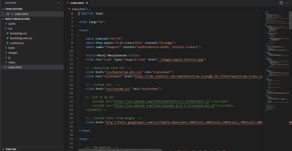
An example of a bootstrap frame working in Visual Studio Code.
CSS Preprocessors
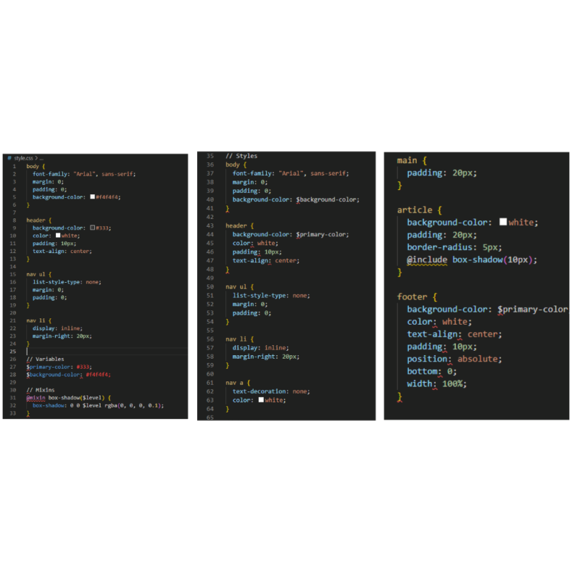
In the dynamic landscape of web development, preprocessors have become indispensable tools, empowering developers with enhanced capabilities for managing and organizing styles. Let’s explore the world of CSS preprocessors and understand how they elevate the process of styling web pages.
What Are CSS Preprocessors?
Preprocessors are scripting languages that extend the functionality of standard style. They introduce features such as variables, nesting, and functions, enabling developers to write more maintainable and modular stylesheets. The preprocessor’s script is then compiled into standard CSS for browser interpretation.
Popular CSS Preprocessors
- Sass (Syntactically Awesome Stylesheets):
- Sass is a mature and widely adopted preprocessor that introduces features like variables, mixins, and nested rules. It enhances code readability and maintainability, making it a favorite among developers.
- Less:
- Less is a backward-compatible language extension for CSS. It provides variables, nested rules, and functions. With its simplicity and easy learning curve, Less is an excellent choice for those new to preprocessors.
- Stylus:
- Stylus takes a minimalist approach, allowing developers to write styles with minimal syntax. It offers flexibility and conciseness, making it a popular choice for those who prefer a more relaxed style.
Advantages of Using CSS Preprocessors
- Variable Support:
- Preprocessors introduce the concept of variables, allowing developers to define values that can be reused throughout the stylesheet. This promotes consistency and simplifies updates.
- Nested Syntax:
- Nesting rules in preprocessor syntax mirrors the HTML structure, enhancing code readability. This makes it easier to understand the hierarchy of styles, especially in complex projects.
- Modular Code with Mixins:
- Mixins enable the creation of reusable code snippets. This modular approach promotes cleaner code organization and reduces redundancy, contributing to a more maintainable codebase.

CSS Grid vs. Flexbox
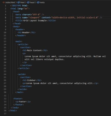
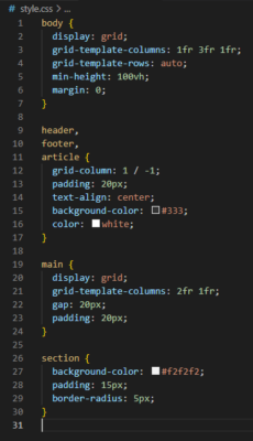
In the realm of the layout techniques, two powerful tools have emerged to address different aspects of web design: The Grid and Flexbox. Understanding the distinctions between these layout models is crucial for web developers seeking to create responsive and visually appealing designs.
CSS Grid
Overview: The Grid is a two-dimensional layout system that enables precise control over both rows and columns. It excels in creating complex, grid-based layouts, making it ideal for designing entire page structures.
Use Cases:
- Grid layouts with consistent row and column structures.
- Full-page layouts where both horizontal and vertical alignment are crucial.
Key Properties:
display: gridgrid-template-rowsandgrid-template-columnsgrid-gapfor spacing between grid items.
Pros:
- Ideal for overall page layout.
- Provides a high level of control over both axes.
- Excellent for creating complex, multi-dimensional designs.
Cons:
- May be overkill for simpler layouts.
- Slightly steeper learning curve compared to Flexbox.
Flexbox
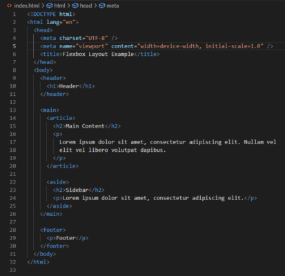
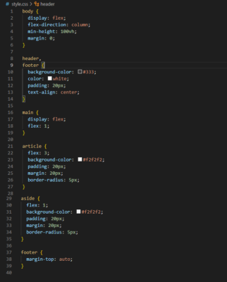
Overview: Flexbox, short for Flexible Box Layout, is a one-dimensional layout model primarily designed for laying out items within a container along a single axis. It excels in distributing space along this axis, making it ideal for components like navigation bars or lists.
Use Cases:
- Aligning items in a single row or column.
- Creating responsive, flexible components.
Key Properties:
display: flexflex-directionfor defining the main axis.justify-contentfor aligning items along the main axis.align-itemsfor aligning items along the cross-axis.
Pros:
- Simple and intuitive for single-axis layouts.
- Well-suited for aligning and distributing items evenly.
- Quick and easy to implement for common scenarios.
Cons:
- Limited in handling two-dimensional layouts.
- May not be the best choice for entire page layouts.
Choosing Between Grid and Flexbox
The decision between CSS Grid and Flexbox often depends on the specific requirements of your layout. If you’re designing an entire page with a complex structure, The Grid is the preferred choice. For smaller components or items within a container, Flexbox provides a simpler solution.
Responsive Design Techniques
In the ever-expanding landscape of diverse devices and screen sizes, implementing responsive design is essential to ensure a seamless user experience. Responsive design techniques enable web developers to create websites that adapt and look great on various devices, from desktops to smartphones.
Media Queries
Definition: Media queries are a fundamental component of responsive design. They allow developers to apply specific styles based on the characteristics of the device, such as screen width, height, or device orientation.

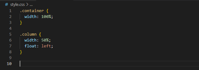
Fluid Grids
Definition: Fluid grids involve using relative units (such as percentages) for layout elements instead of fixed units (like pixels). This allows the layout to adapt smoothly to different screen sizes.
Flexible Images
Definition: To maintain responsiveness, images should also be flexible. Use the max-width: 100%; property to ensure images resize within their parent containers without overflowing.

CSS Flexbox and Grid Layouts
Definition: CSS Flexbox and Grid Layouts provide powerful tools for creating flexible and responsive page structures. These layouts automatically adjust to accommodate different screen sizes.

Viewport Units
Definition: Viewport units are relative units based on the size of the viewport. They allow developers to size elements in relation to the device’s screen dimensions.

CSS Animation Libraries
Adding dynamic and engaging animations to a website enhances user experience and brings designs to life. The animation libraries are powerful tools that simplify the process of creating captivating animations without the need for extensive coding. Let’s explore some popular style animation libraries and understand how they can elevate your web projects.
Animate.css
Overview: Animate.css is a widely-used and beginner-friendly animation library that provides a collection of pre-built style animations. With a simple integration process, developers can add animations such as fade, bounce, and slide to elements on their web pages.

GreenSock Animation Platform (GSAP)
Overview: GSAP is a robust and versatile animation library that goes beyond the animations. It offers precise control over animation timelines, easing functions, and supports various creative effects. GSAP is often used for complex animations and interactive storytelling.

Hover.css
Overview: Hover.css is a lightweight library focused on creating stylish hover effects for elements. It offers a variety of animations triggered by hovering over buttons, links, or images, providing an easy way to add flair to user interactions.

Bounce.js
Overview: Bounce.js is a library specifically designed for creating attention-grabbing bounce animations. It offers customization options for bounce strength, easing, and even allows developers to create their own bounce presets.

CSS-in-JS Solutions
As web development landscapes evolve, the integration of styles with JavaScript has become a common practice. CSS-in-JS solutions provide a seamless way to manage styles in JavaScript-driven applications. Let’s delve into the world of CSS-in-JS, exploring its benefits and popular solutions.
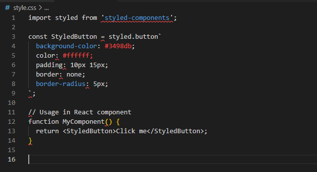
CSS-in-JS refers to the practice of styling components by directly embedding the style within JavaScript files. This approach offers a more modular and scoped styling solution, reducing global namespace collisions and making it easier to manage styles for individual components.
Styled Components
Styled Components is a popular CSS-in-JS library that allows developers to write actual style code directly within their JavaScript files. Each component can have its styles defined inline, ensuring encapsulation and maintainability.
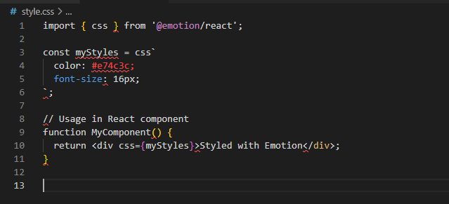
Emotion
Emotion is another CSS-in-JS library that provides a highly performant and flexible solution for styling React components. It supports features like automatic vendor prefixing and theming, making it a versatile choice for styling modern web applications.
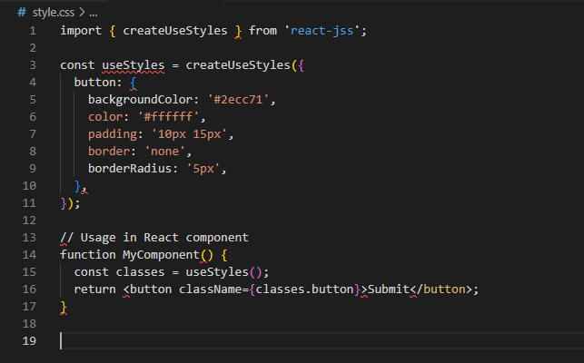
JSS (JavaScript Style Sheets)
SS is a CSS-in-JS library that uses JavaScript objects to define styles. It provides a programmatic way of styling components, making it easy to dynamically generate styles based on application logic.
Performance Optimization with CSS
In the quest for creating fast and efficient web experiences, optimizing the performance of your style is paramount. From minimizing file sizes to reducing rendering times, there are several strategies to ensure that your styles contribute positively to the overall performance of your website.
Minification and Compression
Minifying the style involves removing unnecessary characters, spaces, and line breaks to reduce file size. Additionally, compressing the files using gzip or other compression techniques further decreases the amount of data that needs to be transferred over the network.
Implementation
Build tools or online services can be used for automatically minifying and compressing the style files before deployment.
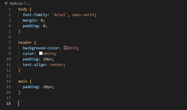
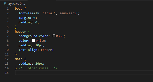
In the non-minified version, it is formatted for readability with indentation, line breaks, and spaces. In the minified version, all unnecessary characters (whitespace, line breaks, etc.) are removed to reduce the file size.
Visually, the non-minified version is more human-readable and easier to work with during development. On the other hand, the minified version is optimized for production, resulting in a smaller file size, which is beneficial for faster website loading times. The minified version sacrifices readability for efficiency in transmission over the network.
This is just a simplified example, and in real-world scenarios, the reduction in file size can be more significant, especially for large CSSstyle files. Minification is a common practice in web development to improve performance.
Reducing HTTP Requests
Minimizing the number of the style files and combining them into a single file reduces the number of HTTP requests required to load a page. This is especially crucial for improving performance on slower network connections.
Implementation:
Concatenate multiple style files into a single file, and consider inlining critical styles directly into the HTML to avoid additional requests.
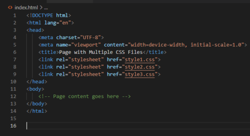
In this case, the browser will make separate HTTP requests for each CSS file (style1.css, style2.css, and style3.css). This can result in multiple round-trips between the browser and the server, potentially leading to increased page load time, especially if the server and the browser are geographically distant.
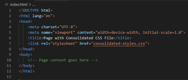
In this case, the browser makes a single HTTP request to fetch the consolidated CSS file (consolidated-styles.css). This reduces the number of round-trips between the browser and the server, resulting in a more efficient loading process.
Impact on Page Load Performance
Consolidating the style files is generally recommended for improving page load performance. This approach reduces the overhead associated with multiple HTTP requests, minimizes latency, and allows the browser to start rendering the page sooner. It is part of best practices in web development to optimize and concatenate the style and JavaScript files to enhance website performance.
Critical Path CSS (Inlining Critical Styles)
Inlining critical styles directly into the HTML (known as Critical Path CSS) ensures that the most essential styles for rendering the initial view of the page are applied quickly, improving perceived performance.
Implementation:
Identify critical styles for above-the-fold content and inline them directly in the HTML head using <style> tags.
Webpage Rendering Timeline

Without Inlining Critical Styles
- Browser fetches HTML.
- HTML parsing begins.
- Browser encounters external style links in the head.
- Additional HTTP requests are made to fetch style files.
- Style files are downloaded and parsed.
- DOM construction continues.
- Render tree is formed.
- Layout and paint operations are performed.
- Finally, the initial paint occurs.

With Inlining Critical Styles
- Browser fetches HTML.
- HTML parsing begins.
- Browser encounters internal styles (inline styles) or inlined critical styles in the head.
- CSS is applied as HTML parsing continues.
- DOM construction is influenced by the applied styles.
- Render tree is formed.
- Layout and paint operations are performed.
- Initial paint occurs.
Visual Representation:
In a visual representation, you can imagine a horizontal timeline from left to right. Each step in the timeline is represented as a segment, and the length of the segment corresponds to the time spent on that particular step.
Without inlining critical styles, you’d see a longer segment for the fetching and parsing, indicating that these operations take more time. With inlining critical styles, you’d observe a shorter styles applying segment because the critical styles are immediately available.
Remember, inlining critical styles is a technique to reduce the critical rendering path length, optimizing the time it takes for the browser to render the initial view of the page. This is especially crucial for improving the perceived performance of a webpage.
Lazy Loading and Code Splitting
Lazy loading and code splitting involve loading style files only when they are needed, reducing the initial load time and improving the overall performance, especially on large and complex websites.
Implementation:
Utilize tools and frameworks that support lazy loading and code splitting, loading styles on demand based on user interactions.
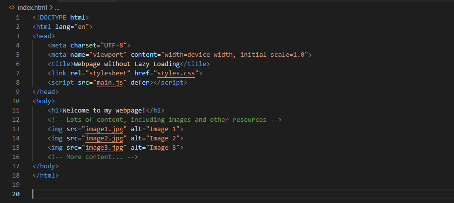
In this example, all resources, including images, are loaded immediately when the page is requested. This can lead to longer page load times, especially if there are many images or other non-critical resources.
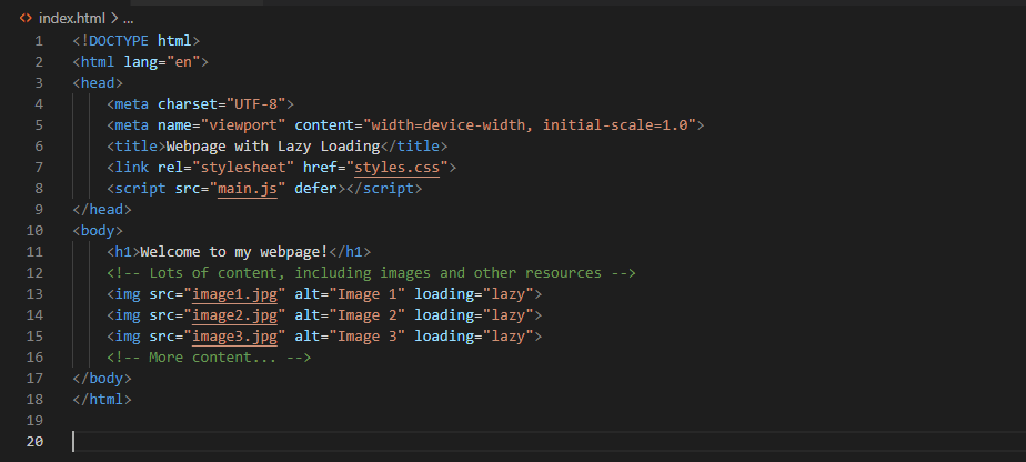
In this example, the loading="lazy" attribute is added to the <img> tags, indicating that the images should be lazily loaded. With lazy loading, the browser delays the loading of these images until they are about to come into the user’s viewport. This can significantly improve the initial page load performance, especially on long pages with lots of images.
Impact on Performance
Without Lazy Loading:
- Longer initial page load time.
- All resources are loaded upfront, even if they are not immediately visible to the user.
With Lazy Loading:
- Faster initial page load time.
- Resources are loaded only when needed, improving perceived performance.
- Reduced bandwidth usage, especially beneficial for users on slower networks.
Optimizing Selectors and Specificity
Efficiently crafted CSS selectors and specificity can improve rendering performance. Avoid overly broad selectors and use the least specific selector necessary to style an element.
Implementation:
Optimize your selectors to target elements directly and avoid unnecessary specificity.
Rendering Timeline with Optimized Selectors
Let’s consider a scenario where a webpage has the rules with optimized selectors:
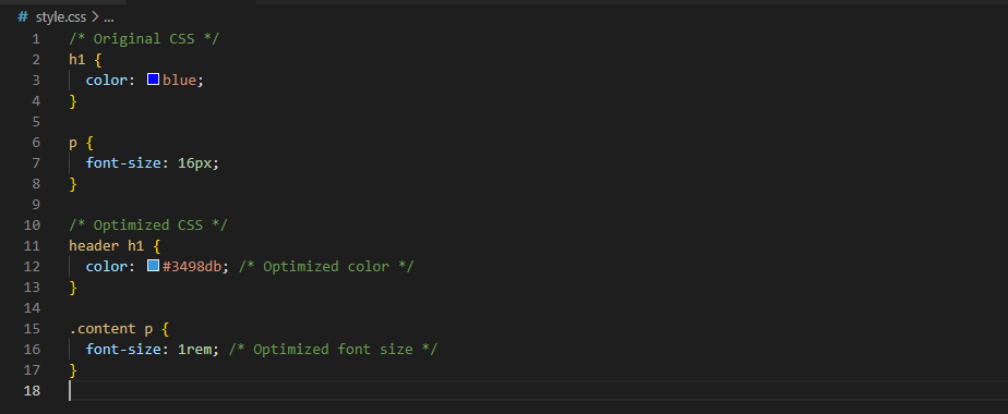
Rendering Timeline Steps

- Browser fetches HTML.
- HTML parsing begins.
- Browser encounters the rules with generic selectors (e.g.,
h1,p). - The rules are applied.
- DOM construction continues.
- Render tree is formed.
- Layout and paint operations are performed.
- Initial paint occurs.

- Browser fetches HTML.
- HTML parsing begins.
- Browser encounters style rules with optimized selectors (e.g.,
header h1,.content p). - Optimized rules are applied directly to specific elements.
- DOM construction is influenced by the applied styles.
- Render tree is formed.
- Layout and paint operations are performed.
- Initial paint occurs.
Visual Representation
In a visual representation, imagine a horizontal timeline from left to right. Each step in the timeline is represented as a segment, and the length of the segment corresponds to the time spent on that particular step.
With optimized selectors, you would observe a shorter segment for applying because the browser can more efficiently apply styles to specific elements. This leads to a faster rendering process and improved page load performance.
The use of optimized selectors, like targeting specific elements with classes or IDs, helps reduce the complexity of rules and improves the efficiency of style application, contributing to a more performant rendering timeline.
Latest CSS Features
Keeping up with the latest features is crucial for web developers to leverage the full potential of styling capabilities and stay ahead in the rapidly evolving world of web design. Let’s explore some of the recent features that have been introduced to enhance the way we create and style web content.
CSS Grid Layout
The Grid Layout is a powerful two-dimensional layout system that allows developers to create complex grid-based designs with ease. It provides precise control over rows and columns, enabling the creation of responsive and dynamic layouts.

CSS Variables (Custom Properties)
Variables, also known as Custom Properties, enable the definition of reusable values in the style. They enhance maintainability by centralizing values, making it easier to update styles across multiple elements.

Flexbox Enhancements
Flexbox, a widely-used layout model, received some enhancements to further simplify the creation of responsive and flexible designs. The gap property was introduced to manage spacing between flex items more efficiently.

Scroll Snap
Scroll Snap enhances the scrolling experience by allowing developers to define specific snap points during scrolling. This feature is particularly useful for creating image carousels or sections that align precisely during scrolling.

Backdrop-filter
The backdrop-filter property adds a filter effect to the area behind an element, often used to create a frosted glass effect. This feature adds a layer of visual appeal to elements with transparent backgrounds.

Staying informed about the latest CSS features empowers developers to create modern and visually stunning web designs. Whether it’s the flexibility of CSS Grid, the efficiency of CSS Variables, or the enhanced capabilities of Flexbox and other features, integrating these advancements into your projects can elevate the overall user experience. Experiment with these features to discover how they can enhance your styling workflow and contribute to the success of your web projects.
Best Practices in CSS
Ensuring that your CSS code follows best practices is essential for maintaining a scalable, readable, and maintainable codebase. Adopting these practices not only enhances collaboration but also contributes to better performance and a more efficient development workflow. Let’s delve into key CSS best practices that every web developer should embrace.
Use a CSS Reset or Normalize.css
Start with a CSS reset or Normalize.css to establish consistent styling across different browsers, eliminating default styling discrepancies. This sets a baseline for your styles and avoids unexpected variations.
Implementation:
Include a link to a CSS reset or Normalize.css file at the beginning of your stylesheet.
Webpage without Reset or Normalize.css
In a typical HTML document without a CSS reset or Normalize.css, browsers have default styling applied to various elements. These default styles may vary between different browsers, leading to inconsistencies in the appearance of elements. For example
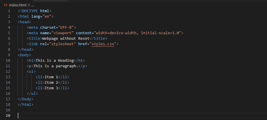
In this example, the browser’s default styles for headings, paragraphs, and lists will be applied, potentially leading to inconsistent spacing, margins, and font sizes across different browsers.
Webpage with Normalize.css
Now, let’s consider a scenario where Normalize.css is used to provide a consistent baseline across browsers
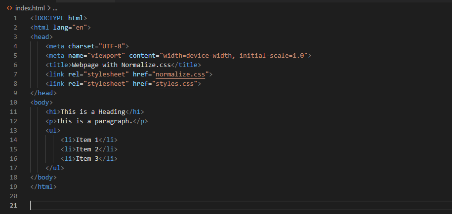
In this example, Normalize.css is used to reset or normalize default styles across different browsers, providing a consistent starting point for styling.
Organize Styles with a Modular Approach
Organize your CSS into modular components or modules. This approach improves code maintainability, readability, and reusability. Each component should encapsulate its styles and functionality.
Implementation:
Use a naming convention like BEM (Block Element Modifier) to structure your class names and keep styles scoped within components.
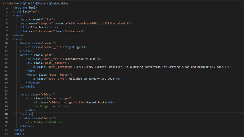
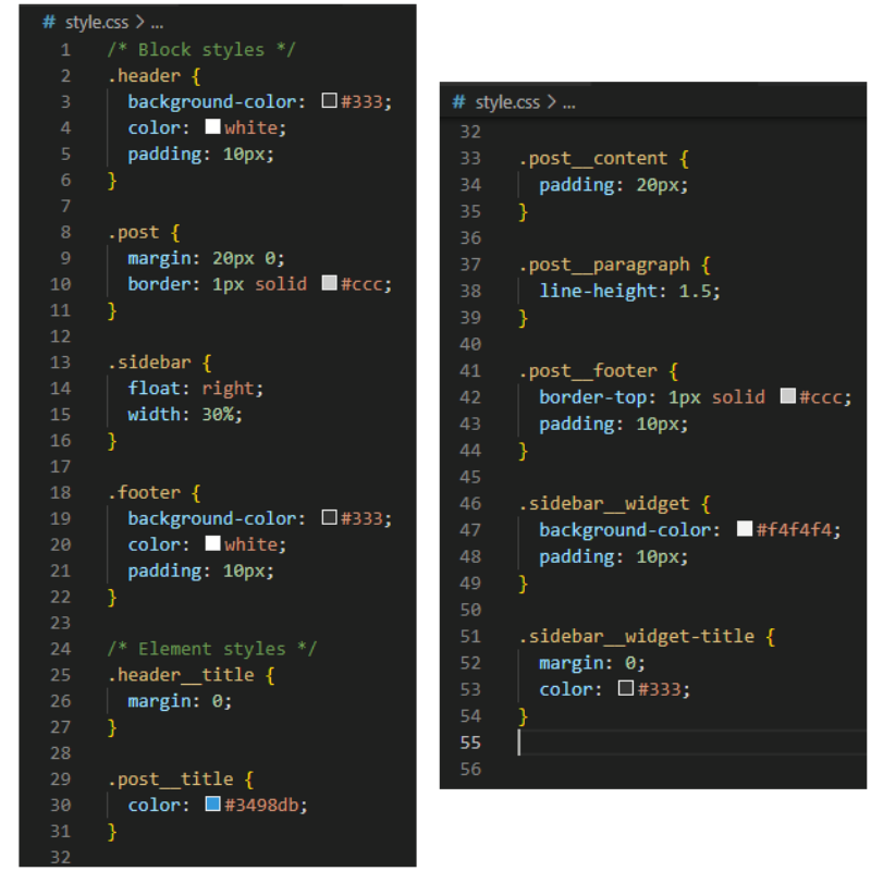
Benefits of Modular Organization with BEM:
- Readability and Maintainability: BEM provides a clear and standardized naming structure, making it easy to understand and maintain the codebase.
- Scalability: BEM scales well as your project grows. The modular structure helps avoid specificity issues and reduces the likelihood of unintentional style conflicts.
- Reusable Components: Components defined by blocks can be reused across different parts of the application without worrying about conflicting styles.
- Easy Collaboration: The naming convention makes it easier for multiple developers to collaborate on the same project, promoting a consistent coding style.
By adopting the BEM convention or a similar modular approach, you create a more organized and maintainable CSS codebase. Each component is self-contained, making it easier to reason about and update styles without unintended side effects.
Minimize the Use of !important
Avoid excessive use of the !important declaration as it can lead to specificity issues and make styles harder to override. Reserve its use for exceptional cases where overriding styles is absolutely necessary.
Implementation:
Prioritize specificity through proper selector usage and avoid relying on !important for styling.
Optimize Selectors for Performance
Choose the most efficient selectors to improve rendering performance. Overly complex or generic selectors can lead to slower page rendering times.
Implementation:
Prefer class and ID selectors over tag selectors, and avoid overly specific or generic selectors.
Prioritize Critical Styles for Above-the-Fold Content
Inline critical styles directly into the HTML head to ensure rapid rendering of above-the-fold content. This enhances the perceived performance of your webpage.
Implementation:
Identify and inline styles that are crucial for the initial view of the page.
Group Related Properties and Use Shorthand
Group related CSS properties together, and use shorthand properties when possible. This enhances code readability and reduces the overall file size.
Implementation:
Combine related properties, such as margin and padding, into shorthand notation.
Conclusion
In the ever-evolving landscape of web development, adopting best practices in CSS is not just a recommendation; it’s a fundamental principle for building robust, maintainable, and performant websites. Whether you’re a seasoned developer or just starting your coding journey, incorporating these practices into your workflow can significantly impact the quality of your code and the overall user experience.
From the foundational step of using a CSS reset or Normalize.css for cross-browser consistency to the modular organization of styles and the optimization of selectors for performance, each practice plays a crucial role in the success of your web projects. Prioritizing critical styles for above-the-fold content, minimizing the use of !important, and adopting a modular approach all contribute to a more readable, maintainable, and scalable codebase.
As you implement these best practices, consider the broader context of web development trends and emerging technologies. Regularly reviewing and updating your codebase ensures that it remains aligned with the latest industry standards.
In the dynamic world of CSS, where new features and techniques continue to emerge, staying informed and adaptable is key. Embrace a mindset of continuous improvement, experiment with cutting-edge CSS features, and be open to refining your approach as the web development landscape evolves.
By adhering to these best practices, you not only enhance the efficiency of your development process but also contribute to the creation of web experiences that are intuitive, responsive, and visually appealing. Keep coding, stay curious, and let these best practices guide you towards building the next generation of outstanding web applications. Happy coding!
